May 2014
Toggle button, meet current state
Toggle buttons have a very basic function: they let us switch between two states. They’re the digital equivalent of an on-off switch. And if we’re not careful in their use, we can give them just the same problem.
Example:

On, then off, then… Or is it off first? Hm.
A “pure” switch control is a state toggle. This means it doesn’t display any information regarding state, other than its binary position (think of a checkbox without a label). That leaves the need for something more.
The software play/pause pattern is a good example. Here is iTunes playing, and then iTunes when paused:
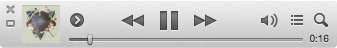
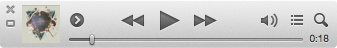
So here’s a proper toggle: It tells you what iTunes will do if you click it, and that this action is different whether the music is playing or not. Play, pause, play, pause.
But the most important piece of information is provided with sound. You know iTunes is playing because you hear music. Only then does the pause button become self-explanatory.
Most of the time, we don’t have music to tell us the current state of something. So we have to actually build something that signals this state – we have to add something that complements the toggle control. Something that gives context and ties it to the toggle’s action.
It can be as simple as small labels outside of it:


Note, though, that with switch-like toggles, if two labels can be a solution, using only one can easily bring the same problem.
You don’t want a user wondering if the word “on” refers to the current state or the other one. Apple are really insistent on not doing this. So users have to remember whether they mean “This feature is on” or “use me to turn this feature on”:
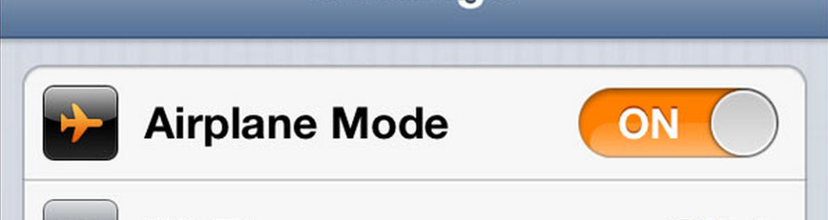
And recent updates have made it so that – without a special setting in the Accessibility section – you don’t the label at all.
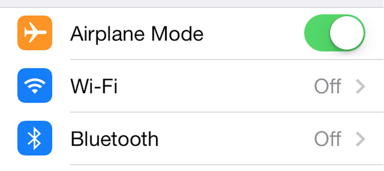
Without proper context, a toggle is a button that sneakily turns into a different button when pressed. No one likes mystery meat buttons.
I personally like to remember the music analogy when using toggles in an interface. I probably don’t have the convenience of playing music, so how can I make a given state (and its alternative) obvious?